
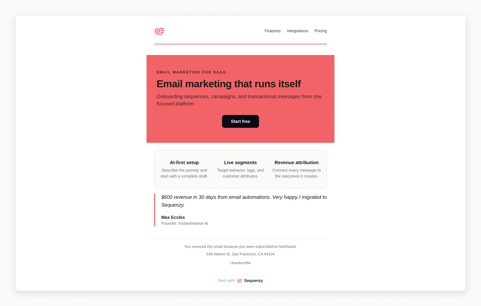
Looking Up a Block’s Fields
The pages below describe what each block is for. When you are writing blocks by hand - through the API, the CLI, or an AI agent over MCP - you can read the exact fields each type accepts:GET /api/v1/email-blocks, through the get_email_block_schema MCP tool, and as the sequenzy://email-blocks MCP resource. It is generated from the schemas that validate a write, so it always matches what is actually accepted. If the MCP tool is missing from a client’s tool list, enable it on the Sequenzy connector, or read the resource or HTTP endpoint instead of inferring fields from live HTML.
Lists are the one shape worth knowing up front, because they are their own block type rather than a text variant:
text block accepts only variant: "paragraph", "lead", or "html", and never accepts items. Use list for a plain numbered or bulleted list, and steps for a visual numbered walkthrough. List items carry content; steps items carry title and an optional description.
Hero
The hero block overlays a headline, supporting text, and a call-to-action button on a full-width background image - the signature opening section of modern marketing emails.- Image variant: your text sits on top of a background photo with an adjustable color scrim that keeps it readable. The hero runs edge-to-edge when full bleed is enabled.
- Color variant: the same layout on a solid color band, useful when you do not have a suitable image.
- Settings: eyebrow label, heading, subheading, button, overlay color and opacity, minimum height, and left or center content alignment.
Testimonial
A styled quote block for social proof, with author name, role, an optional round avatar, and an optional 1-5 star rating rendered in your brand color.- Card: quote on a softly tinted panel
- Minimal: editorial style with an accent border on the left
- Centered: a large centered quote with a decorative quote mark
- Quote: a serif pull-quote with a short accent rule and letterspaced attribution
- Editorial: a large serif quote set between thin hairline rules - the most magazine-like treatment, with no panel at all
Gallery
A multi-image grid for lookbooks, product roundups, and event photos.- Two-up: pairs of images per row
- Three-up: three images per row
- Mosaic: one large image with a row of smaller images below
Badge
A small label pill for eyebrows and status tags, for example NEW, SALE, or CASE STUDY.- Pill: filled with your brand color
- Outline: bordered
- Soft: tinted background with brand-colored text
Table
A data table for pricing changes, plan comparisons, specs, and order summaries. You define up to six columns (each with its own left, center, or right alignment) and up to 30 rows of plain-text cells - merge tags work inside cells.- Header row: shown by default on a tinted background, or hide it for simple grids
- Zebra striping: tint every other row for easier scanning on longer tables
Features
A feature-highlight grid: icon, title, and description items arranged in one to three columns.- Cards: each feature on a tinted tile
- Plain: centered text without panels
- Icon left: the icon sits beside each feature as a text row
Image Card
An image and copy paired on a single card: picture, title, description, and an optional button.- Image top: the image spans the card with content below, like a blog or product card
- Image left / Image right: the image sits beside the copy in a split layout
Image Shapes
Image blocks can be masked into organic shapes - arch, circle, leaf, petal, squircle, scallop, flower, and blob - for an editorial, Flodesk-style look. Pick a shape under Style in the image settings. Shapes work in every email client, including Gmail and Outlook: the shape is baked into the delivered image server-side rather than applied with CSS, so recipients see exactly what you see in the editor. Any image with a fixed URL can be shaped - library uploads (including AI-generated images), Pexels and Unsplash stock photos, and other external images, which are automatically saved into your media library when you apply a shape so the delivered image can never change or disappear underneath the mask. Only dynamic image sources (merge tags, per-recipient product images) cannot be shaped, since they resolve at send time. A shaped animated GIF or WebP shows its first frame as a still image, so leave animations unshaped to keep them moving. A shape replaces the frame and corner radius options for that image. Width, alignment, links, captions, and fixed-height cropping keep working as usual. When you write blocks through the API, CLI, or MCP, set the image block’s optionalshape field to one of arch, ellipse, leaf, petal, squircle, scallop, flower, or blob. Use a media-library, Pexels, or Unsplash URL on those surfaces; arbitrary external URLs are preserved unshaped until they are imported into the media library in the editor.
Header
A header band for the top of your email, built around your company logo (the same logo your logo block uses).- Logo only: just the logo, left-aligned or centered
- Logo + button: logo on the left, a brand-colored button on the right
- Logo + nav: logo on the left with up to four text links on the right, like a website masthead
Button Styles
Buttons come in five styles so every email does not have to end in the same filled pill:- Fill: your brand color as a solid button - the default
- Outline: a bordered button with brand-colored text
- Pill: a fully rounded filled button
- Ink: a near-black editorial fill that pairs with any brand color
- Link: a quiet letterspaced-caps text link with a trailing arrow, for secondary actions and soft section endings
Setting button colors through the API
In the editor, the Button color and Text color pickers write to the block’sbuttonColor and buttonTextColor fields. The separate Background control
writes to styles.backgroundColor, which is the band the block sits in rather
than the button itself.
That distinction matters when you write blocks through the API, CLI, or MCP:
Leave
buttonColor and buttonTextColor unset to inherit your email theme’s
primary color - that is why a button can keep its old color after you set
styles.backgroundColor on it.
Campaign, template, transactional, A/B test variant, and sequence email step
writes that set a field a block does not support still succeed, and the response
carries a warnings array naming the ignored field and the fields that block
does accept. The CLI prints those warnings, and MCP returns them in the tool
result.
A write that is rejected outright gets the same information as an error: the
block type it was validated against, that type’s required and optional fields,
the shape of any item array involved, and every field you sent that the type
does not accept.
Repeated Blocks Are Reported
Every block you send is stored. Nothing is removed for looking like a duplicate. When a run of two or more blocks repeats the run immediately before it, campaign and template writes add a note to the samewarnings array, so a generator that
emitted the same section twice is easy to spot without the API deciding for you.
Block ids, styling, and whitespace differences are ignored when detecting a
repeat, so a section you deliberately repeated in a second colored band is
reported too - that is a note about your blocks, not a change to them. Sequence
email steps do not report repeated runs yet.
Blocks that come back from AI email generation are the exception: those are
de-duplicated before they reach a draft, because a model repeating the whole
body is a generation fault rather than a choice.
Image Captions and Frames
Image blocks can carry a small muted caption line below the photo, and an optional frame treatment:- Border: a thin hairline drawn directly around the image
- Mat: a white gallery mat inside a hairline border, like a framed print
Numbered Headings
Turn on Show heading number in heading settings to add a number such as “01” beside your heading. The Heading number field appears only when enabled. Turn it off to return to an ordinary heading. The Numbered Heading component starts with this option enabled.Ready-Made Editorial Components
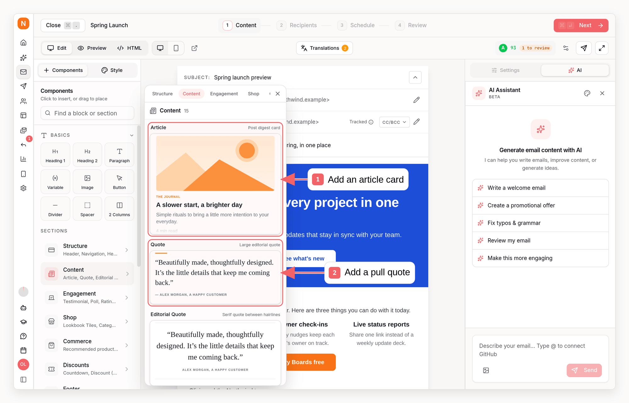
/ slash menu) includes composed editorial pieces you can drop in as-is:
- Framed Box: a thick-bordered square section with a numbered heading - the brutalist “make one point well” panel
- Numbered Heading: a heading with an oversized “01” index already attached
- Editorial Quote: the serif pull-quote between hairline rules
- Ledger: a borderless label/value table for specs, editions, and statements
- Dots and Accent Bar dividers from the More blocks group