
Email Editor
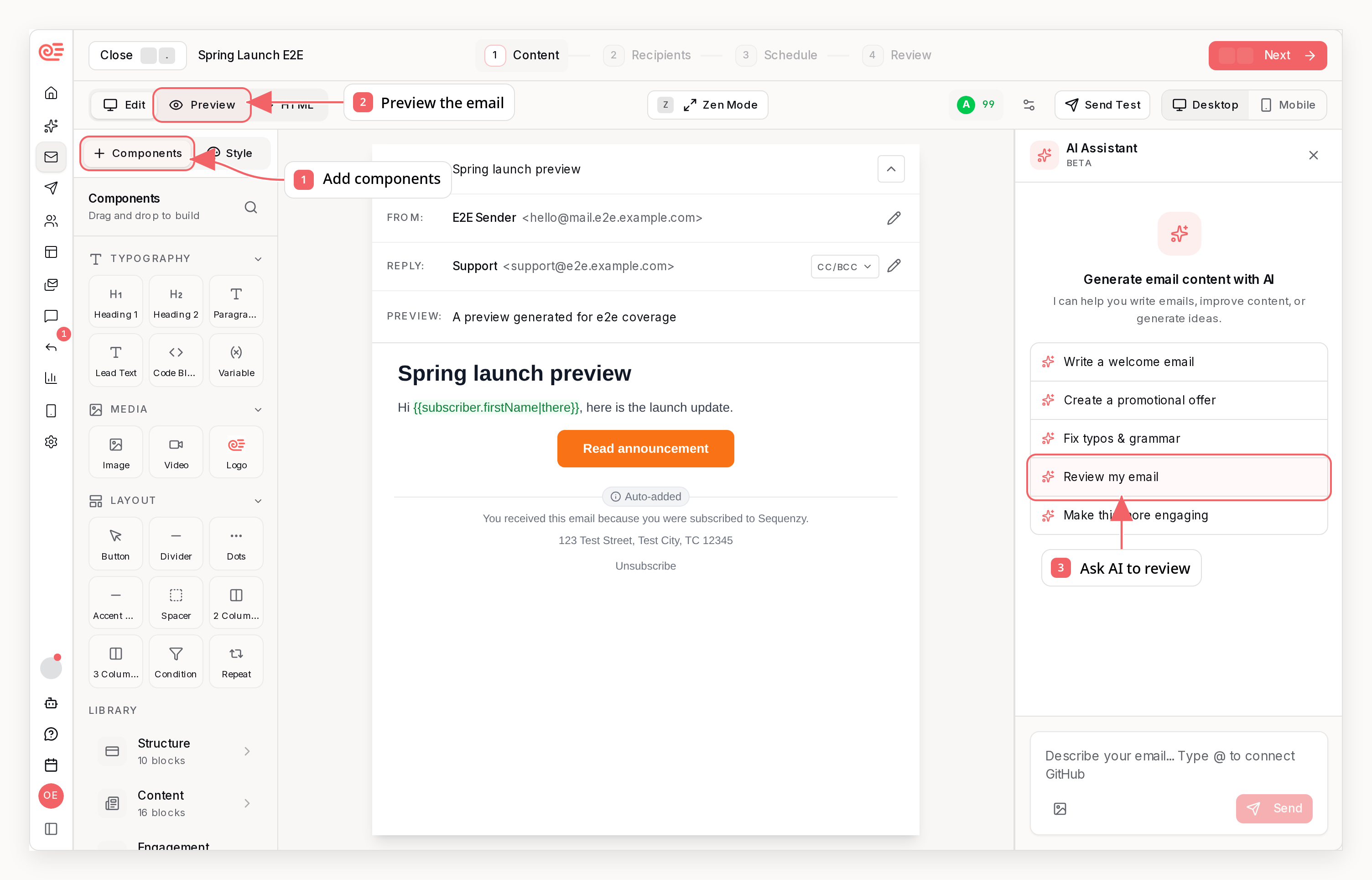
Editor Overview
The editor consists of three main areas:- Canvas - The central area where you build your email
- Components panel - Left sidebar with blocks and ready-made sections
- Settings / AI - Right sidebar for selected-block settings and the AI assistant
Saving and discarding changes
Discard changes restores the last saved version. Its Undo action restores email content and expires when you edit, save, or navigate history. If you also changed settings such as styles, sender details, or attachments, you must confirm the reset because content Undo cannot restore those settings.Editing on smaller screens
On tablets, the AI assistant opens beside your email so you can keep editing. On phones, it opens as a modal panel; close it or press Escape to return to the editor. Your chat draft stays intact when you resize between phone and tablet layouts. In Preview, use Simulate to switch devices, dark mode, and blocked images for both block and HTML emails. Phone controls also include preview data and test sends.Default Components
The email editor provides a comprehensive set of building blocks:Basics
The first group in the Components panel holds the blocks most emails use. Click a block to insert it below the selected block, or drag it into place.Sections
Ready-made sections (Structure, Content, Engagement, Shop, Commerce, Discounts and Footer) are listed one per row directly under Basics, each with a short summary of the blocks inside. Select a row to open a gallery of rendered previews.More blocks
Advanced
Advanced is expanded by default so logic and code blocks are immediately available.Engagement
The Engagement section holds testimonials, star ratings and the two feedback blocks:
Poll and NPS Survey save each recipient’s latest answer to a subscriber
attribute and emit a
poll.answered event for segmentation and automations.
Testimonial and Rating are static display blocks. See
Polls & NPS Surveys for setup, styling, results, and API
examples.
Product Blocks
Product blocks can render a fixed product from your synced catalog or a dynamic product from merge-tag data. Use synced products when the email should always show the same item. Use dynamic product data when the product comes from an event, such as a replenishment or back-in-stock sequence. Dynamic product blocks can read values such as:{{product.title}}{{product.imageUrl}}{{product.url}}{{product.price}}{{event.product.title}}{{event.product.imageUrl}}{{event.product.url}}{{event.product.price}}
event.product, so you can preview the same email with different sample products before sending.
Repeat Blocks
Use a Repeat block to render one group of child blocks per item in a list. The block settings start with one question - What to show - with a single choice per answer:- Recommended products - picked automatically per recipient. Also available as a one-click Recommended products block in the picker’s Commerce section. A Ranking setting chooses the strategy: personalized for each recipient (browsing first, then similar shoppers, then store-popular, then newest in stock), best sellers by recent order volume, newest products, or the recipient’s recently viewed items. Activity-based strategies accept an Activity window (default 30 days). A product never repeats within a list or across lists in the same email. You can optionally narrow recommendations with catalog filters. See Product Recommendations for the full behavior and attribution stats.
- Store catalog - your synced catalog, sorted by newest, price, or title, with optional filters by tag, collection, vendor, product type, or price range, resolved at send time. Out-of-stock products are excluded by default.
- Skip already-purchased products leaves out anything the recipient bought in the last year. It is on by default for recommendations and off by default for catalog lists.
- Match the trigger event’s product only shows products related to the product on the event that triggered the email - for example, a browse-abandonment sequence recommending items related to the viewed product. You choose which attributes must overlap: tags, collection, product type, or brand, and whether products need to match any of the selected attributes or all of them. The default is any shared tag, collection, or type. The event’s own product is never shown, and the toggle is ignored for sends without a product event, such as campaigns.
- Hand-picked products - choose exactly which products to show and in what order. Titles, images, prices, and stock stay synced with your store.
- Campaign list - a personalized list computed by the campaign’s personalization rules.
- Custom variable - point the block at an array in your data, such as
order items. A source path of
itemsreads theitemsarray from transactional API variables and lets child blocks use scoped merge tags like{{item.title}},{{item.description}}, and{{item.number}}.
{{product.title}}, {{product.imageUrl}},
{{product.price}}, {{product.url}}, and {{product.buttonText}}. The item
alias lives under Advanced in the block settings.
Item templates. The block settings include ready-made layouts - a card
grid, a single-product spotlight, compact thumbnail rows, and a minimal text
list - so you can restyle a repeated list in one click. Applying a template
replaces the blocks inside the list.
Item style. The Item Style section controls how each repeated item is
drawn: padding, background, corner radius, border, an optional fixed item
height, and a Column content toggle that aligns each child row across
items (Distribute). Turn on Custom space between blocks to set an
exact vertical gap between the blocks inside each item - set it to 0 to pack
a title, subtitle, and button flush together instead of using the theme’s
default block spacing.
The preview data panel shows editable rows for variable-backed repeat sources.
Store-product lists preview with real products from your catalog instead.
Structure and Content sections
The Structure section holds layout pieces: Header, Navigation, Hero, CTA, Card, Feature, Image Card, Badge, Framed Box and Alert. Clicking a Header is the one insertion exception: it goes to the top of the email (dragging one places it where you drop it). The Content section holds editorial blocks: Article, Quote, Editorial Quote, Numbered Heading, Ledger, List, Table, Features, Steps, Stats, Pricing, Gallery, Product Grid, Author and Signature. Author settings separate layout, author details and the optional link. Edit the name and role directly in the sidebar; Card also offers a short bio. Switching layouts preserves your saved photo and bio. Add both link text and a URL to display the author link.Footer
Working with Blocks
Adding Blocks
- Select the block you want to build on, then click a block in the Components panel
- It appears right below your selection (or at the end of the email when nothing is selected) and becomes the new selection, so the next click continues below it. Blocks that open a dialog first (Image, products, variables) land in the same place once you confirm. A clicked Header goes to the top, and a block that cannot sit in that spot (such as a footer inside a group) is added at the end instead
- Drag a block from the panel instead to drop it exactly where you want it
Editing Blocks
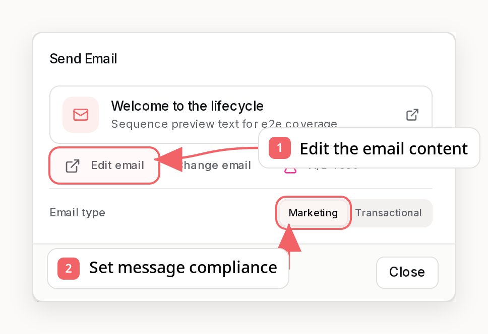
- Click a block to select it
- Edit text directly in the canvas
- Use the settings icon for advanced options
Formatting Text
Select any text in a text or heading block to open the formatting toolbar. From there you can apply:- Bold (⌘/Ctrl+B), Italic (⌘/Ctrl+I), and Underline (⌘/Ctrl+U)
- Strikethrough and inline code
- Text color, links, bullet and numbered lists, and alignment
Markdown Shortcuts
The editor recognizes common markdown as you type:Code
Use inline code for short fragments like coupon codes, variable names, or short commands. Wrap the text in single backticks (`SAVE10`) or select it
and click Code in the toolbar.
For longer snippets, add a dedicated Code block from the / insert menu (or
the add-block button). It is a standalone block you can drag and reorder like
any other. Type your code directly into it across as many lines as you need -
indentation and line breaks are preserved exactly, and Enter simply adds a
new line.
Code themes
Give a code block a color theme to match your email’s style. Open the block’s settings panel and pick from Light (the default), Dark, Midnight, Terminal, or Solarized. Themes use plain inline background and text colors (no syntax highlighting), so they render consistently across email clients.Code blocks render identically in the editor and the delivered email, so what
you see while editing is what your subscribers receive.
Working With HTML Blocks
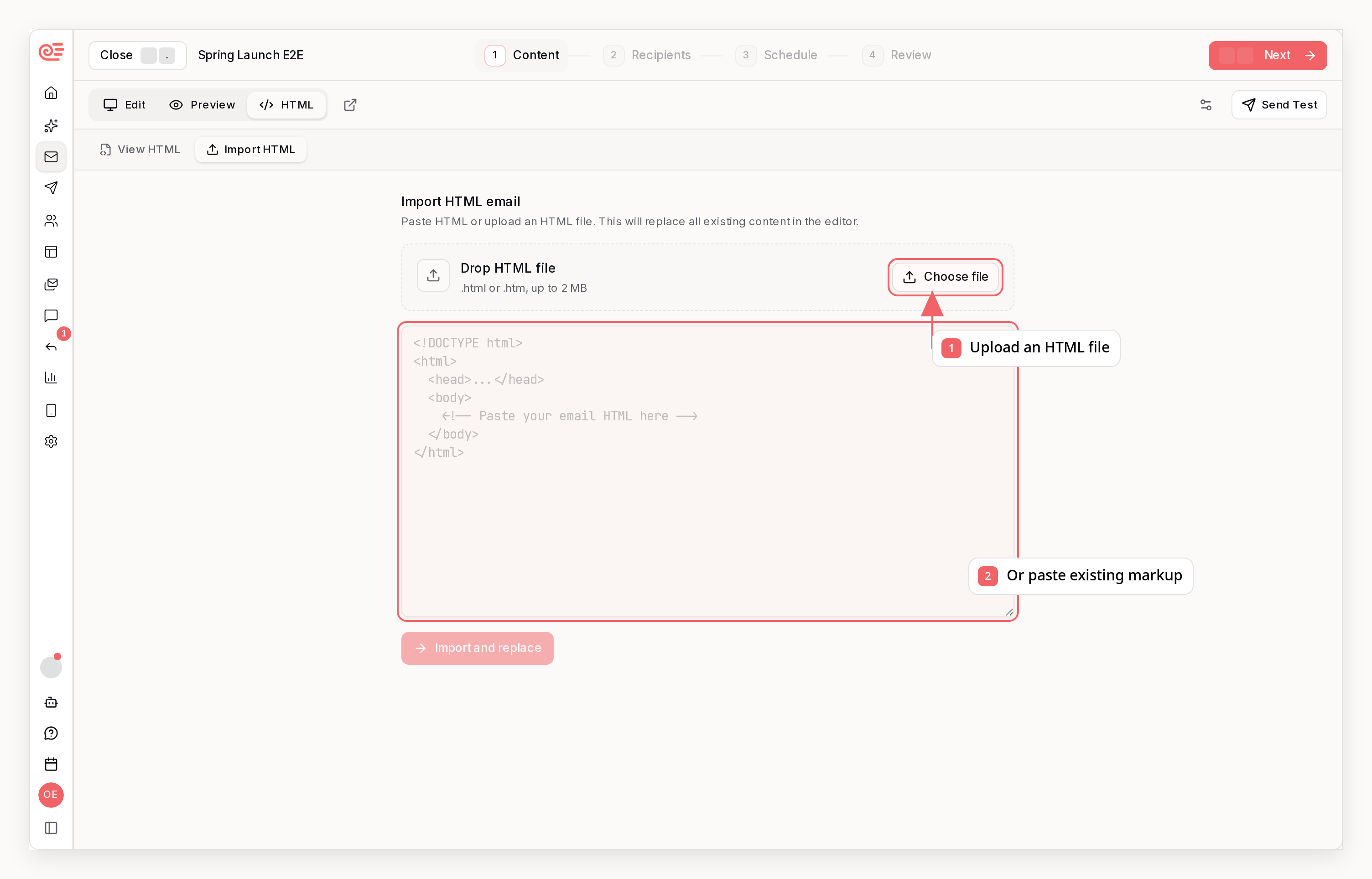
- Add the HTML block from the component panel or slash menu
- Paste your snippet into the inline code editor
- Review the live preview below the editor
- Keep the HTML snippet-focused; use the full HTML editor only when the entire email is custom code
HTML blocks support merge tags like
{{ FIRST_NAME }} and are rendered in the
same email pipeline as the rest of your blocks.Block Actions
When you select a block, you’ll see action buttons:- Settings - Shows all block controls in one panel. On wide screens it opens automatically when you select a block, and the Settings / AI switch at the top of the right panel highlights to show where the controls went. Use the switch to move between block controls and the assistant. Settings is unavailable until you select a block, and the panel returns to the assistant when you deselect it
- Duplicate - Create a copy of the block
- Delete - Remove the block
Reusable Components
You can save your own reusable components from the same block editor.- Select a block and click Save Block in the Components sidebar to save that block for reuse
- Click Save Section to save multiple adjacent top-level blocks as one reusable component
- Open AI in the Components sidebar if you want Sequenzy to generate a reusable section from a prompt
- Insert saved components later from the sidebar, the inline add menu, or drag and drop
Saved components use the same email blocks as the main editor, so after you
insert one you can keep editing it like any other part of your email.
Drag and Drop
Blocks can be reordered by:- Hovering over the block
- Clicking the grip handle on the left
- Dragging to the new position
Fonts
Choose from 50+ fonts to match your brand. The font applies to your entire email and can be changed in the Email Style panel.Selecting a Font
- Open the Email Style panel (left sidebar, gear icon)
- Click the “Font family” dropdown
- Select a font—the dropdown shows a preview of each option
- Your email updates immediately
System Fonts
These fonts are installed on most devices and render consistently across all email clients:Web Fonts
Web fonts from Google Fonts give you more design options. They render in modern email clients (Gmail, Apple Mail, Outlook.com) with automatic fallbacks for older clients. Popular sans-serif fonts:- Inter, Roboto, Open Sans, Lato, Montserrat, Poppins
- DM Sans, Manrope, Plus Jakarta Sans, Space Grotesk
- Merriweather, Playfair Display, Lora, PT Serif
- Source Serif 4, Libre Baskerville, EB Garamond
- Bebas Neue, Oswald, Anton
- Roboto Mono, Fira Code, JetBrains Mono, Space Mono
Font Fallbacks
All fonts include fallback stacks. If the primary font doesn’t load, the email gracefully falls back:AI Email Assistant
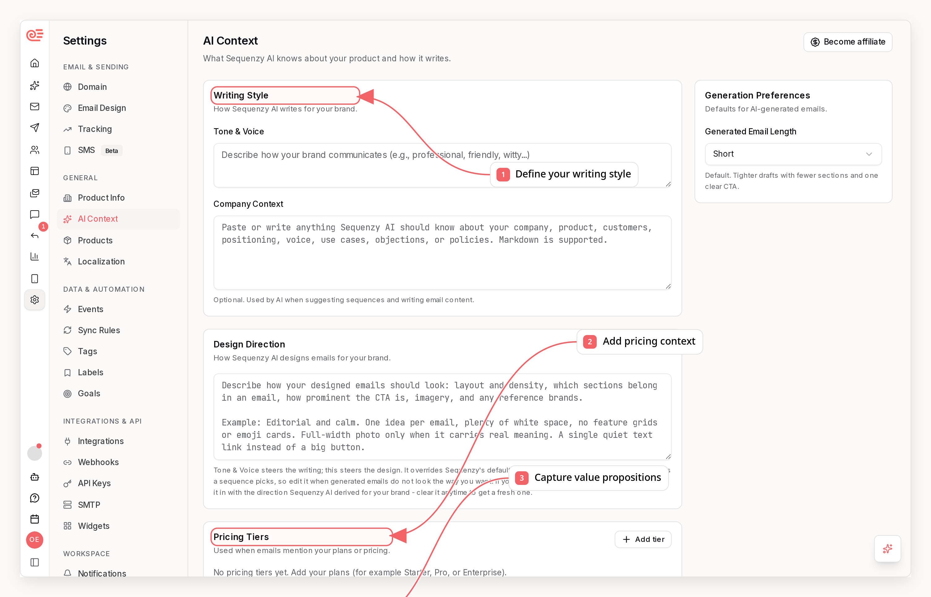
Generating Content
Type a prompt to generate email content:- “Write a welcome email for new users”
- “Create a promotional email for our summer sale”
- “Make this email more engaging”
Copying Email Designs
You can copy email designs from screenshots or images:- Click the attachment icon in the AI chat
- Upload a screenshot of an email you want to recreate
- Type “Copy this email design” or similar prompt
- The AI will recreate the structure using Sequenzy blocks
When copying emails, the AI preserves the structure and layout while adapting
content to use your company information and personalization variables.
Example Prompts
Creating new emails:- “Write a 3-email welcome sequence”
- “Create an abandoned cart reminder”
- “Generate a product announcement email”
- “Make the headline more compelling”
- “Add a testimonial section”
- “Shorten this email”
- “Copy this email design” (with image attached)
- “Recreate this layout with my brand colors”
- “Use this structure but change the content to be about [topic]“
Personalization Variables
Use variables to personalize emails for each subscriber:
To insert a variable, click Variable in Basics. Search the available fields or type your own name, such as
subscriber.plan or event.order.total. You can paste a complete tag and add optional fallback text for missing values. Review the tag, then click Insert variable. It replaces selected text or inserts at your last text cursor; without a text cursor, it adds a paragraph after your selected block. Cancel leaves your content unchanged.
You can also type {{ directly in a text block to use the inline picker.
Preview & Testing
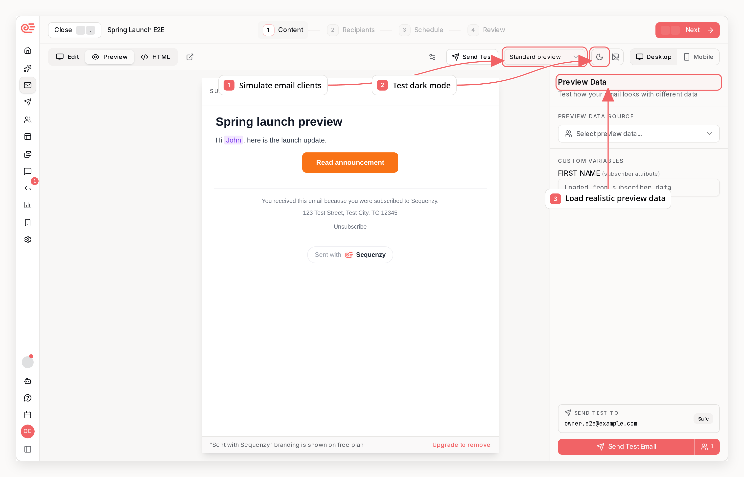
Preview Mode
Toggle between desktop and mobile preview to see how your email looks on different devices.Send Test Email
Before sending a campaign:- Click “Send Test”
- Select a subscriber to receive the test
- Check the email in your inbox
Best Practices
Design Tips
- Start with a logo - Add brand recognition at the top
- Use clear headings - Break up content with hierarchy
- One primary CTA - Focus attention on the main action
- Add whitespace - Use spacers to improve readability
- Include footer - Always have unsubscribe and company info
Content Tips
- Keep it concise - Respect your readers’ time
- Personalize - Use variables for a personal touch
- Mobile-first - Most emails are read on mobile
- Clear value - Lead with what’s in it for the reader
Related
Campaigns
Send one-time email broadcasts
Sequences
Build automated email workflows
Transactional
Send triggered emails via API
Variables
Learn about subscriber data